
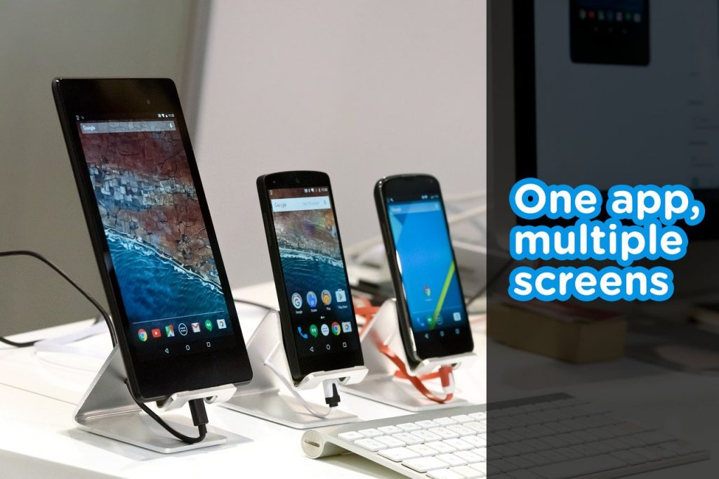
Over time, Android has evolved to what it is and is currently still evolving. Android has support for mobile phone, smartwatches, tablets, TVs and cars.
Responsiveness has always been a thing. Let’s look at mobile devices alone. There are a lot of mobile phones that run Android. These devices have different screen sizes and screen resolutions. Diving into other devices like watches or TV, the disparity in screen sizes is even more obvious.
I have listed the defaults for mobiles, tablets and TVs below:
Mobile: Portrait
Tablet: Portrait / Landscape
TV: Landscape
Because of this, it’s important to understand responsiveness and build for Android with that in mind. Different screens have different preferences by default and it’s important to account for them when building.
This is an example of a responsive app:
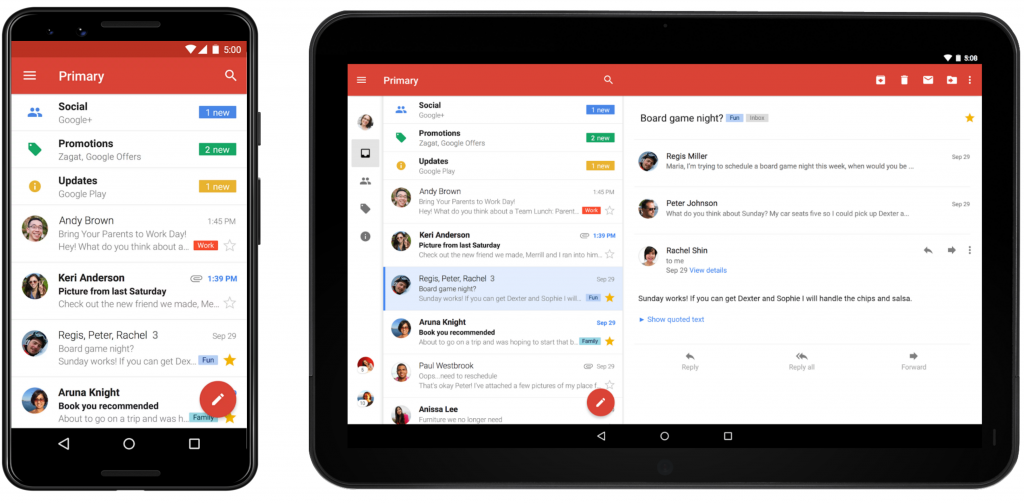
On the smaller screen, we can see just the email list while the larger screen has enough space to show the email body (on the right side).
Think about it. It’s not a very good use of space if the larger screen had just the list as well and the right side was empty 🤷🏼♀️.
Okay, so how do we build responsive layouts?
Use a ConstraintLayout as the root layout:
As opposed to other layouts, a ConstraintLayout allows you position and style widgets in a flexible way. The ConstraintLayout is similar to RelativeLayout because it also displays child view in relative positions. However, it is more flexible than the RelativeLayout and is very easy to use with the Layout Editor.
What if I already use a different layout in my project and I want to change?
It’s actually easy to do. Just follow these simple steps.
- Add the ConstraintLayout dependency to your project.
implementation 'androidx.constraintlayout:constraintlayout:2.0.0-alpha3'
- Sync your project
- Open the existing layout file in design mode
- In the Component Tree window, right-click the layout and click convert layout to ConstraintLayout.
- You’re all done!
Create alternative layout files:
Using a ConstraintLayout is not a 100% guarantee that the structure of the layout will be fit for all screens (e.g. a mobile phone and a desktop). In cases like this, you can have multiple layout directories for the different screen sizes you are building for (similar to the way we have multiple drawable and mipmap directories ).
Use match_parent & wrap_content everywhere possible:
It’s very important to avoid hardcoded dimensions. These restrict the layout screen to a particular screen and kills all efforts of trying to make it responsive. Layouts that use match_parent or wrap_content as their width & height are more flexible.
android:layout_width="145dp"android:layout_width>="match_parent"
What’s next after we build responsive layouts?
It’s very important to test your app across multiple devices to be certain it looks as it should. I have just one Android device, so I use Android emulators when checking stuff out. Alternatively, you can use Firebase Test Lab.
When publishing your apps to the store, you can also restrict the type of devices that your apps can be installed on. With this, you can restrict your apps to mobile phones and tablets, or just mobile phones, or just TV. You have the power to do whatever you want!
Thank you for this post. Have you found any issues using ConstraintLayout?
You’re welcome. No, I haven’t. It seems to work for me.
Hey, can this work on android 2.3.3? I can’t find the dependency that you used. Thanks.